

Saturday, 7 May 2011
Sekret Firmy Cover

Friday, 6 May 2011
Nobrow 5

At last another blog post! Not really breaking news anymore, but here's my contribution to Nobrow 5: "Some of my favourite things". The brief was to create a repeat pattern out of 20 of my favourite things(...), 3 spot colours + GOLD! The repeat pattern was extremely difficult to work out, and was just totally against the grain of how I usually make pictures, so I decided to keep the colours as simple as possible, just using pink and yellow to create the black..(or dark blue, as it turned out!) I'm fairly happy with the result, but it got a little bit too technical this time for me to really enjoy the process.

As for the actual image, I decided to take on a different "persona", with a more interesting collection of "favourite things" than I myself have... I chose to be an explorer/botanist/adventurer from the early 1900's, loosely based on the exploits of Col. Percy Fawcett, a renegade explorer of the Amazon jungle, who vanished without a trace in 1925 serching for El Dorado(or the city of Z, as he called it)...The creature in the middle started out a tiger, but morped into a bat. His prize trophy; a golden tiger-bat!


Thursday, 17 March 2011
A couple more..

Here are some strange characters I did for an exhibition called "The Elephant Graveyard", which features a nice bunch of fresh faced (though in my case: old and haggard) illustrators at Urban Outfitters in Bristol. Thanks to Liam and Adam for putting on the show!

And yes...This is work in progress on another piece...(I got it framed and sent off before I got it scanned...What a dork!) I'll hopefully post a better version soon! I've always been intrigued by Victorian greenhouses.. And I love the prints of German biologist Ernst Haeckel. This is probably the most time consuming piece I've done...possibly ever! And I was supposed to be loosening up!!
Free stylin'

Phew! Finally managed to squeeze in a blog post! Things have been pretty hectic lately...
I've been doing quite a lot of self initiated stuff though, which has been incredibly liberating... No art directors, no size restrictions, no narratives that demand continuity, no deadlines, but time to experiment with new techniques and take risks......

I have a vague theme that I'm steering towards, but I'm sort of just "free styling" a lot of the time. The pieces can end up completely different than originally planned, by throwing in a strange character or suddenly turning the background into a jungle for example. The work I've been doing recently seem to be snapshots of some bigger story. My hope is that if I keep doing this long enough, they will start coming together somehow.

Tuesday, 1 February 2011
The History of Children's Playground Games

Here's a project I did at the end of last year for The British Library.
It's an "interactive" illustration for a website dedicated to the last 100 years or so of children's playground games. It features lots of old footage of what kids used to do before they had computer games and mobile phones.
Unfortunately I had to alter the composition to make it easier to navigate, but never mind!
Wedding Invitations

This summer my lovely sister is getting married to Tim, one of best friends! It was with great pleasure I got to design and print their wedding invitations!
Here's a goofy picture of me from the screen printing sessions at SNAP. A big thanks to Ben Newman for helping me out big time!
Tim is a really good songwriter, by the way, and I've had the pleasure to play drums for his band "The Weary Band" on a number of occasions...Check out some demos and stuff here.
New York Chili Festival


Happy New Year! I know it's a bit late, but hey! I've made it through January without getting the English Winter Blues! Yey! Although my studio is still like a deep freezer, I now have a wood burning stove in my house to keep me warm, so I can get through the days just thinking about chucking logs on the fire, pouring a glass of whisky and putting on a black and white film...Ah..My life is kinda complete now!
Anyway..Here's an illustration I did for Yee Haw a few weeks ago. A poster for a Chili Festival, where 30 odd chefs compete to make the most devilishly nice chili! Should have been there!
Monday, 15 November 2010
The Future of Science Education

Just did this piece for Futurelab. The article is about making Science education seem more exciting and relevant to kids. Whish my old teachers could have read it back in the day!
Friday, 29 October 2010
The Grand Prize

Here is a painting I recently did for Edition Peix in Berlin. Really enjoyed a bit of hands-on painting after months behind a computer screen! The theme I had to work on was "Der Grosse Preis", which I think means "the Grand Prize", and will be printed on a promotional 2012 (2012! German efficiency!) calendar alongside great illustrators such as Atak, Olaf Hajek, Martin Haake and Martin Jarrie.
Thursday, 28 October 2010
Buzzards and Dreadful Crows

Here is a tea towel I designed a while back for a lovely Finnish company called Kauniste. Even though "birds" isn't the most original theme, I do like drawing them, at least when I can make them a bit odd looking. Inspired by Indian folk art, North American Indian art and Inuit art, I hope it's not too twee! I've even thrown a couple of communist agitators in there! Anyway, the design is called "Song Birds" or more exotically; "Laululinnut" in Finnish.


The Wolf's Whistle

Hello there! Sorry it's been so long. I've been really busy the last few months working on a new picture book called "The Wolf's Whistle". It's the story of what happened before the well known fairy tale of the Three Little Pigs. Turns out there's more to the story than previously thought, and that the wolf might not be such a bad guy after all! The book will be published by the Nobrow Press in mid November. It'll be printed in three spot colours; Red, Blue and Yellow, and hopefully the result will look a little something like this:


Wednesday, 21 July 2010
Appalachian Power!
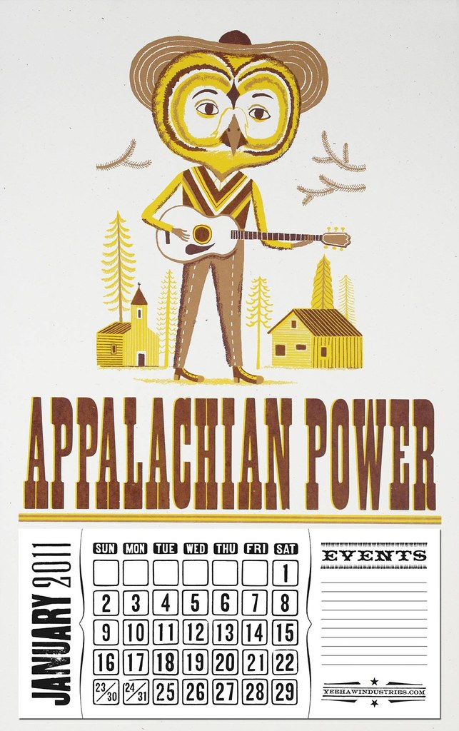
Yee Haw have made a big calendar with my owl illustration on it. Looks great I reckon! Nip over to Yee Haw's etsy shop and place an order!
Thursday, 8 July 2010
Open Studios 2010
 The annual "Open Studios" exhibition at Jamaica Street Artists (my office) went ahead a couple of weeks ago. They just keep getting better. Lots of people swung buy and I sold quite well.
After a year dominated by digital work, I managed to cut loose and experiment with pains and varnishes, which I had wanted to do for a long time. Very refreshing! The time pressure forced me to make bold decisions, making it harder to over-work the images (some would say "finish the images", probably...) I want to do more of this actually...Putting up stuff of various degrees of completion. Some times there is beauty in the incomplete. And it's more interesting. I'm very into primary colours at the moment after seeing the "Van Doesburg and the International Avant Garde" exhibition at Tate Modern. Such an amazing exhibition! Couldn't help being inspired!
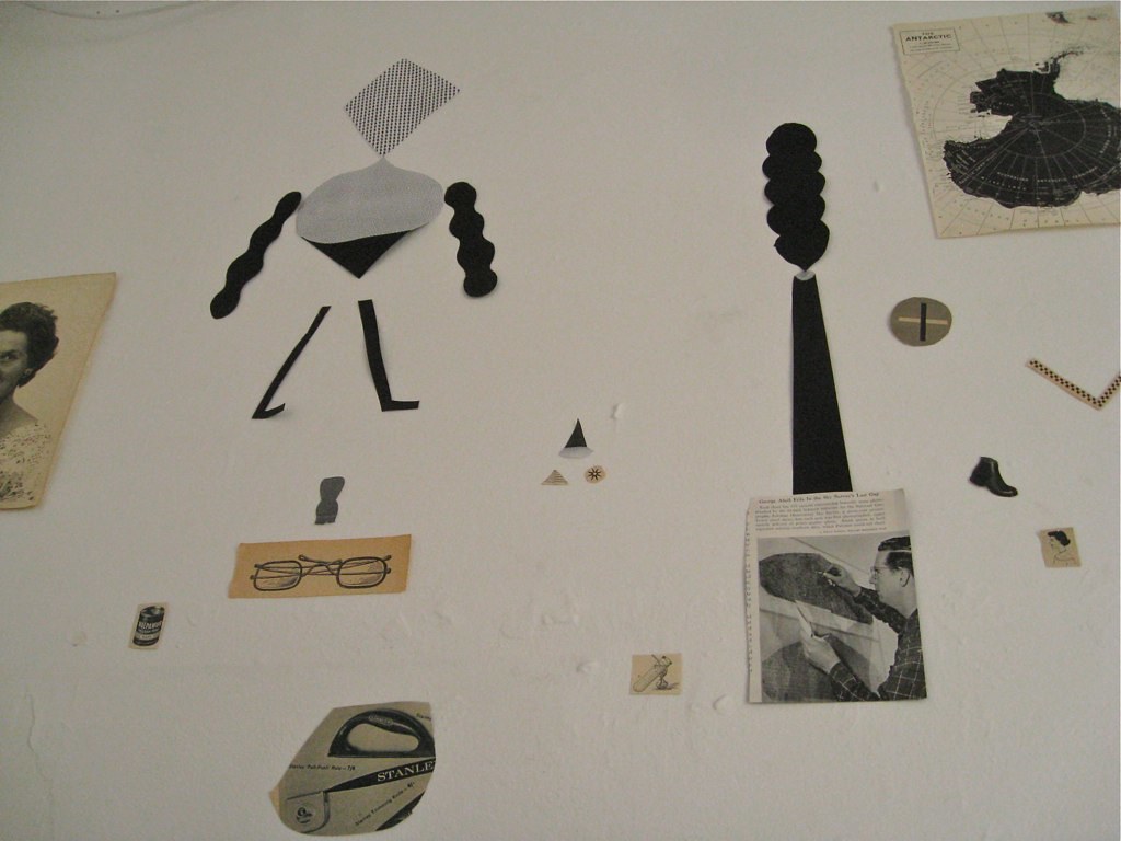
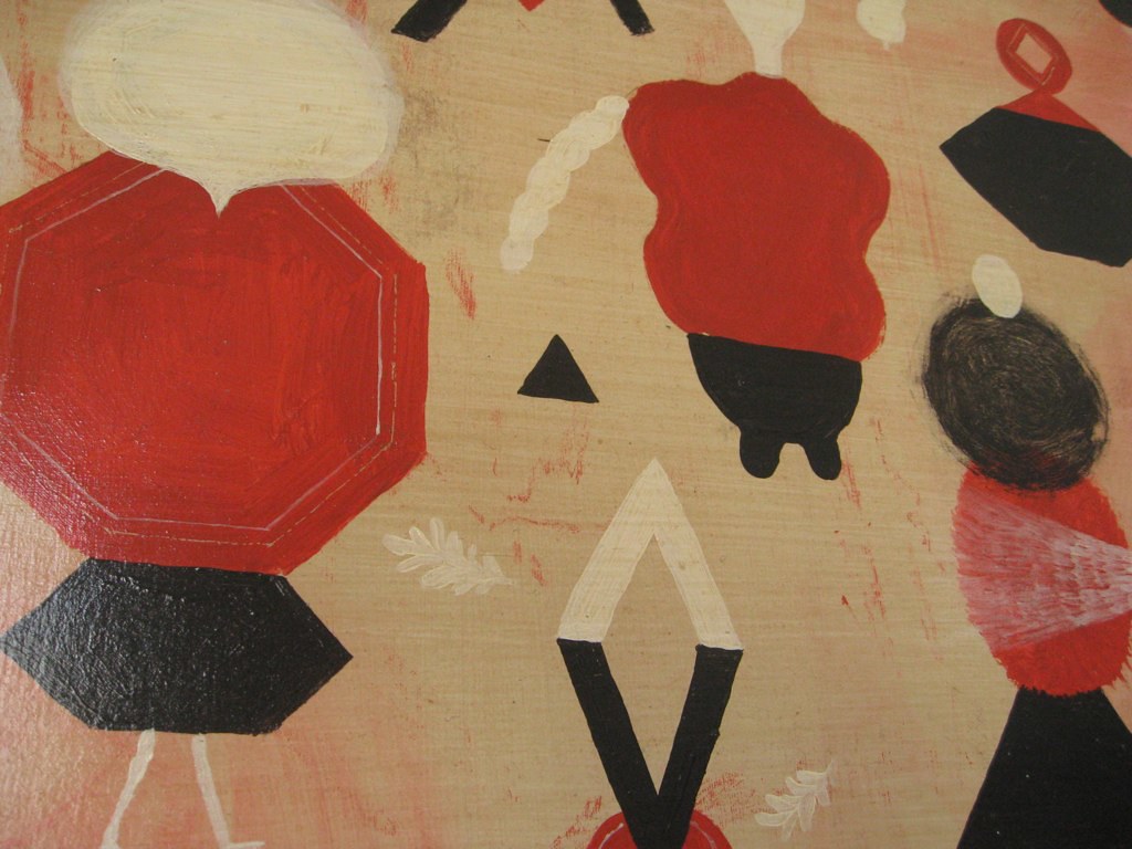


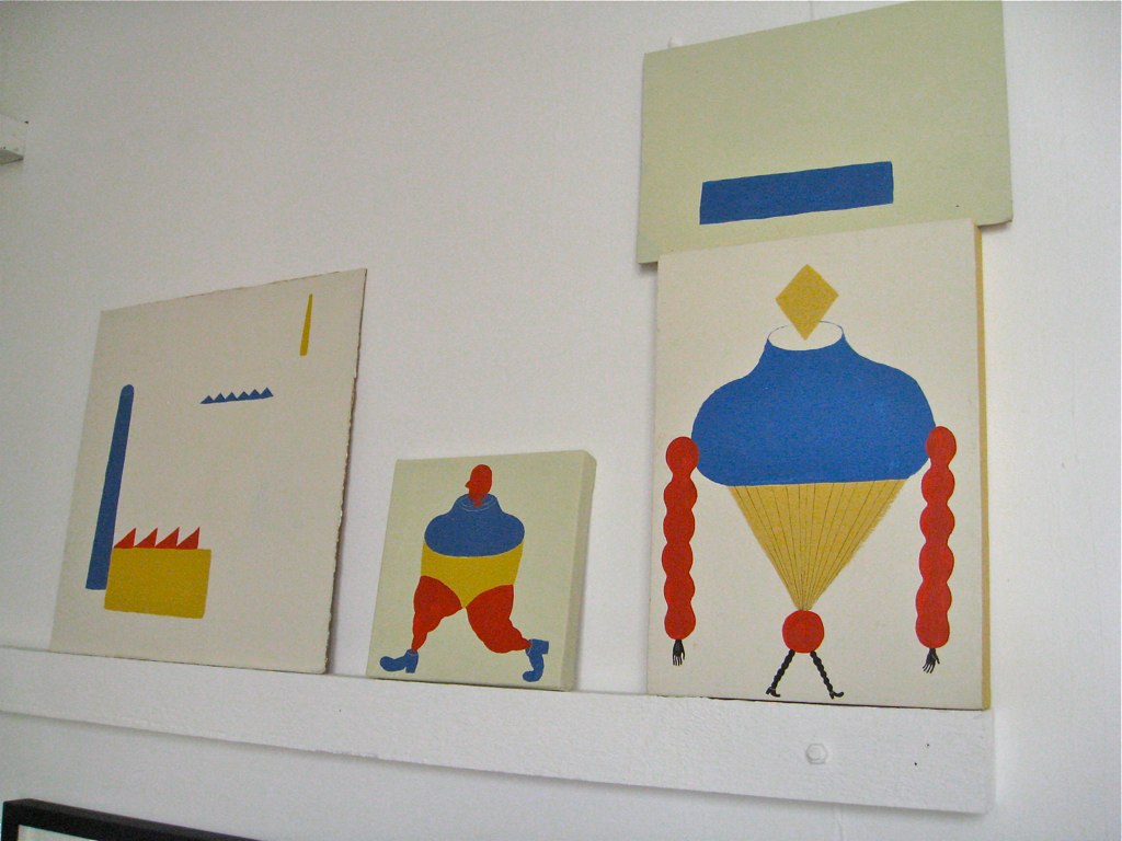
Save the polar bear!
 It's been a while since I've posted anything on this here blog. Guess it's a good thing really. The weather has been amazing lately and I've been exceedingly busy with various projects and exhibitions.
 I recently finished this map/game for the Norwegian recycling company "Grønt Punkt" . It's a big wall chart, 100x70 cm, that will be distributed to primary schools around Norway. The main objective of this game is to encourage classes to recycle all their milk and juice cartons every day and to raise awareness about environmental issues. After a year of recycling and learning, classes can enter a big competition to win a cash prize and polar bear adoptations.

This is one of those jobs where you kind of have to put your own preferred "style" to one side, and just to do what the brief demands. The client has been really nice to work for and sometimes it's nice to be able to just do a job. I enjoyed researching old maps anyway!
Friday, 21 May 2010
Summer Fun!


 Here's some spots I just did for Baltimore Magazine in the US. They're gonna be printed very small, and shouldn't have taken me as long as they did...Oh well. I think they came out all right in the end!
The Gold Heart Mountaintop Queen Directory


These funny old skirts are now on sale over at Yee Haw's Etsy Store. Go'get'em girls! I really recommend having a good old browse while you're there. Better than the Argos catalogue!

By the way, this is a redesign of an image I originally did for a limited edition Monobird 7".
Cheating you say? Nah! Good to get a bit more mileage out of it!
Monday, 10 May 2010
Log drivers
 Here's another piece I've done recently. It's called "Log drivers on the Drammen River" and is another "homage" to the old river workers of my home town. It appeared in my local newspaper as part of a series called "Drammen Illustrated" which each week features a picture by an artist who either lives in or have some connection to the city. Drammen has undergone some dramatic changes in recent years. Traffic has been diverted through hillside tunnels, opening access to the river for the first time with promenades, artificial parks and beaches. A very costly facelift I'm sure, but it has definitely given the town an air of optimism.
With this piece though, I wanted to remind people that the city wasn't built by sipping cappuccino in a riverside cafe, but rather by the toil and work of thousands of workers with soggy feet and calloused hands!
Sunday, 2 May 2010
Topsy Turvy!

Nobrow no.3 is out! Which means I can finally post the picture I did for it. Once again, the guys at Nobrow are encouraging creative use of spot colours, and once again, they've managed to gather an impressive bunch of artists to do so. Pretty chuffed to find myself in the company of Olaf Hajek and Johnny Hannah I must admit. I haven't seen the magazine yet, so I can't wait to get my filthy hands on it!
The theme this time was "Topsy Turvy", which means "upside down" or "inside out". Saturnalia was an ancient Roman festival where the social order was completely turned on it's head; slaves and masters swapped roles, feuds and arguments were put on hold and people gave each other gifts and basically just had a massive party. I really enjoyed this one. Spent ages researching it, although it's by no means historically accurate!

Who We Were and What We Meant by It...

I just finished this album sleeve for My Two Toms, a Bristol band I've been a fan of for years. They play a stompin' kind of lo-fi country/bluegrass. 100% instrumental, but fully fantastic! Banjo, guitar (sometimes with ridiculously sloppy strings) and the occasional ukulele with maracas duck taped to their shoes. If this sounds like your kinda thing, check them out here: http://www.mytwotoms.co.uk. It's gonna be a 12' vinyl release, so I can't wait to see it printed! Should be out in a few weeks time!

The idea for this image is based on the old way of transporting timber; floating it down stream from the forests to the shipment harbours, saw mills and paper factories. The town I grew up in, Drammen, was built on this trade, so in a way it's a little homage to the log drivers of my home town.
Wednesday, 28 April 2010
Set Your Body Free!

Here's a job I did last week for the Norwegian Directorate of Health. It's a poster for "Verdens Aktivitetsdag 10 mai", a campaign to encourage people over 65 to start exercising (however moderately) as a way to prevent various illnesses. A nice bread and butter job!
Monday, 29 March 2010
Hot Rod

Friday, 26 February 2010
Foreign Fiction Prize

Here's a picture I did a couple of weeks ago for Standpoint Magazine. It's to go with an article written by one of the judges of this year's Foreign Fiction Prize. He argues that even though fiction translated into English only accounts for about 3% of books published in Britain, this does not mean that they are necessarily any good!!
Some really big Norwegian literary names gets a pretty rough time in this article, and apparently the author will stay well away from any books with the words "Norway" or "Norwegian" in the future! Nice to work with a really juicy and opinionated text for a change, although I'll probably never work for Norwegian publishing again after this!
Tuesday, 9 February 2010
Narrative Coaching

Here's a job I just finished for "Coaching at Work" magazine. Its about "narrative coaching", a type of coaching which focuses on meaning values and aspiration. It seeks to shape new, alternative and more meaningful stories about client's lives and specific events...I could do with some of that!
Tropical Robots!
 Happy New Year! Better late than never. Had a bit of a break from the old blog. Been on strike. Trade union voted for industrial action. Only joking. Here's some stuff I've did for Yee Haw a few weeks ago; Robots! One colour only. The plan is to do eight in this series. Half way there!


Subscribe to:
Posts (Atom)


